Quantcast
Channel: TrendXplorer
Viewing all 70 articles
Browse latest View live

Value Investing By Proxy

$
0
0
By many Benjamin Graham is considered to be the father of "value investing" and with his book "The Intelligent Investor", Mr. Graham brought value investing to the individual investor.


Mr. Graham advised the investor to always hold bonds in his investment portfolio:
"We recommend that the investor divide his holdings between high-grade bonds and leading common stocks; that the proportion held in bonds be never less than 25% or more than 75% with the converse being necessarily true for the common-stock component."
Combining Mr. Graham's recommendation with the concept of paired switching previously discussed, leads to the following long only application:
  • Intermittently rebalance a basket of VTI (stocks) and TLT (bonds) and allocate 75% of capital to the best performing EFT and the remaining 25% to the other ETF.
  • The rebalancing frequency may be set for example to quarterly or monthly.
  • Performance is measured using total return over the prior quarter or prior three months.
Building such a "Value Investing By Proxy" model in Excel is fairly easy using monthly adjusted closes available from Yahoo! Finance (VTI, TLT).


Especially the Quarterly model is particularly suitable for investors confronted with a minimum 90 day holding period for their accounts.


For both models the spreadsheets are available on the Google Drive connected to this blog. For backtesting on prolonged price history, the synthetically created assets come in useful (see here for details). Remember to update the price data in Excel periodically.

Instead of manually downloading, importing and sorting price data using Excel, a more sophisticated approach is achievable through AmiBroker. The software not only takes care of automated downloads and updates, but also allows for flexible asset pair compositions and quick adjustments of backtesting settings.

The below examples show AmiBroker's equity curves (semi-log scale) for the monthly respectively quarterly strategies using two long term mutual funds FDVLX and VUSTX. The backtests start on December 31, 1986 including the October 19, 1987 Black Monday world wide stock market crash.

FDVLX - VUSTX with monthly rebalancing. Backtest includes the 1987 "Black Monday" crash.
FDVLX - VUSTX with quarterly rebalancing. Again, the backtest includes the 1987 "Black Monday" crash.

If you have AmiBroker or if you want to run the trial-version, a free copy of the ValueInvesting.afl is available on Google Drive too.

Please note the AmiBroker script is intended for monthly data, hence adjust the Backtester Settings accordingly to Monthly or Quarterly Periodicity. For proper execution the user needs to set StocksTicker, BondsTicker and Momentum Length through the Parameter window too (see below screenshots).

 
Settings for Monthly Model

Settings for Quarterly Model

Acknowledgment goes to "varan" for developing and sharing this naive value investing concept in a comment on SeekingAlpha. Once again SanzProphet and "fxshrat" did a great job by providing help on finalizing the code for AmiBroker.

Please share your thoughts and ideas in the comment section below. More to come after the summer break!


Engineering Returns With Multi Asset Universes

$
0
0
Before the engineering starts: Only four months ago, the pageview counter passed the 100,000 milestone. In all likelihood the 200,000 mark will be hit today. Thank you very much for your interest.

The series about Harvesting Momentum (see part I, part II and part III) largely covered pairwise strategies. Now it is time to investigate the performance of more diversified universes to generate returns.


A recent post on CSSA presented Momentum Score Matrices as a tool for predicting the profitability of a given asset universe. Assuming a random walk, the momentum profitability depends on the degree in dispersion of mean returns between the assets in a portfolio. David Varadi states: "A heterogeneous universe of assets such as one containing diverse asset classes will have different sources of returns- and hence greater dispersion- than a homogeneous universe such as sectors within a stock index."

Following a similar, but simplified approach to the cross-sectional dispersion of mean returns, the pairwise momentum score can be calculated as the population average of the squared difference between the momentum values of asset ABC against asset XYZ. Or in "R":

Dispersion (D) for $IEF - $TIP based on 3 month returns during 2001 - 2014. Average = 8

For an asset collection consisting of 14 assets, this approach results in the below matrix. The calculations can be performed using "R", Excel or AmiBroker. Examples of each are available on the Google Drive connected to this post. AmiBroker has the benefit of exporting the momentum matrix as html-file, which then can be imported into Excel for analysis (and prettifying).

Dispersion matix based on 3 month returns using synthetic $ETF's

Out of the above asset collection several portfolio's can be assembled. For each portfolio the previously introduced monthly asset rotation strategy is be applied, resulting in the below performance overview.


Based on the readings of the key performance indicators, the N=8 universe was the most profitable. For this universe the portfolio performance breaks down to the following graphs.

N=8 Equity Chart
N=8 Yearly Profits
N=8 Profit distribution

Even though the performance over the 2001 - 2014 bear-bull-bear-bull market cycles is pretty impressive and the strategy already has its build-in c(r)ash protection by allocating capital in treasuries during bear markets, trend filtering can be applied in search for ways to improve profitability.


The trendfilter works like a circuit breaker. Capital can only be allocated to assets that pass the trendfilter test. Each trendfilter is based on the assets own price data, with the exception for the last one, which is an index level trendfilter based on the S&P500 index data (a la Alexander Clenow's filter). The length of the simple and exponential moving averages is based on the default lookback period used in this post: 3 months, hence 4 bars. The index level filter compares a 3 month (4 bars) EMA against a 6 month (7 bars) EMA to distinguish rising trends for stocks in general. 

All but one of the trendfilter versions lead to lower CAR, Sharpe, Sortino, Calmar and Ulcer, except for the SMA4 > SMA4[1] version. Applied to monthly quotes this filter compares the current (or last) value of a 4 bar simple moving average against the next to last reading. So for an asset to pass this filter its SMA has to be rising. Albeit the lower CAR, it is interesting to note that the exponential index level trendfilter results in substantially lower max draw down and volatility.

SPY: Buy & Hold (black) compared with SPY filtered on the index level (red)

The code for AmiBroker strategy with the trend filtering implemented is available on the Google Drive. Look for the MRS_TF.afl


On the Google Drive also an example of the Excel spreadsheet for this strategy (also known as Simple GMR) is available for the N=6 universe mentioned in the overview table above, though without trend filtering. 


Please share your thoughts and idea's in the comment section below. Of course donations are welcome too. As a matter of fact the donation ratio lies below $1/1000 pageviews. Curiously this ratio only has dropped since the last milestone was reached...

[Edit August 25, 2014: dispersion_table.afl updated with automatic count for average length]
[Edit August 26, 2014: Excel example for N=6 universe made available on the Google Drive]

About time, leverage and a few grains of salt (Synthetic Prices Part II)

$
0
0
Just in time to be vintage 2014 I finally managed to write a long overdue blog post. Nevertheless thanks to a loyal crowd of readers this year has seen two, actually three, landmarks in the pageview stats. Once beyond the 100k milestone, the 200k mark was surpassed quite fast. A couple of weeks ago the near silent touch of a fabulous 250k followed: one quarter of a million pageviews!Wow! And right now at the cusp of 2015 the counter is steadily turning its way towards 300k. Thank you for all your interest, the rewarding exchange of ideas and your support during this remarkable year.


Regarding today's posting, it is a sequel to the Composing Synthetic Prices For Extended Historical ETF Data post back in May. Using "R", the language for statistical computing and graphics (get it here), thanks to Michael Kapler's excellent Systematic Investor Toolbox for R: SIT, it is possible to compose synthetic ETF's with extended historical data retrieved from suitable mutual funds on full auto while taking care of a seamless fit along the way. 

In this post, I will demonstrate how to perform the same task in AmiBroker with two extra benefits: the application of leverage and the option for inverse data treatment. Of course, an R-savvy coder could probably achieve the same in R, but not me.

The below example shows $TLT as synthetic symbol with data going back to 1986*. The $ETF is based on the price data for TLT (green section) available from Yahoo and extended with VUSTX data (red section) from the same source.


In the next example leverage is applied: using SSO data for the duration of its availability (green section) followed by SPY data (red section) with a leverage setting of 2 it is possible to clone $SSO going back all the way until 1993*.


To generate the synthetic prices the following code is used for user input, price calculation and symbol creation in AmiBroker's database.


An example should crystallize the concept: notice the code sets about by cloning the actual SSO data, starting at the most recent end of day bar and walks back into time, bar by bar, until SSO's inception date is reached (the green section of the chart). As soon as quotes for SSO are no longer available (remember: we are going back into time!), the code switches to the base fund or index, which needs to be loaded as the current charted symbol (see settings below: for SSO it would be SPY or ^GSPC). From now on (the red section of the chart) the code calculates the synthetic prices by applying the leverage factor to the, if need be inverted, data of the charted symbol.

The entire synthesizing procedure is performed by AmiBroker including feeding the data needed by the code to perform the operation. Of course the the necessary prices have to be stored beforehand in AmiBroker's database through AmiQuote or the Import Wizard.

I happen to like the $-sign as prefix for synthetic symbols, so that is the prefix the code the Parameter settings window offers by default:


Tip: to generate synthetic prices for ETF's like the UltraShort SDS just use a negative leverage factor, i.e. -2 for SDS while utilizing the same workflow.

After the preparations are done for a particular $ETF, the actual extension by AmiBroker is virtually instantaneous and the synthetic $ETF is immediately stored in the current data base. You only need to perform the task quite meticulously.


Please follow the settings on the above screenshot exactly, so load the correct symbol on the chart, set to Daily, adjust Apply to *Current and Range: All quotes. Finally to create the $ETF, hit Scan and the symbol is created in a blink of an eye.

For GLD with prices going back to November 2004 there is not a suitable source on Yahoo. Quandl offers London Bullion Market Association Gold prices dating back to April 1968 for download to csv (thanks SP!), but Quandl's data quality is not always up to par. So for the below extending of the GLD price series the high quality subscription data from Norgate Premium Data is used: XAUUSD with history starting early 1984.

BTW: for reasons unknown to me, the code occasionally generates a price stream full of errors, even with all the correct settings dialed in:

Erroneous data stream due to monthly chart setting (intentionally invoked for demonstration purposes)

Luckily there is an easy fix: just press Scan again (after checking for the right the charted symbol again):


To demonstrate the usage of an external data source as well as applying data inversion, let's synthesize $ZIV. According to the Fund Summary for ZIV on Yahoo "the investment seeks to replicate, net of expenses, the inverse of the daily performance of the S&P 500 VIX Mid-Term Futures index." So for extending ZIV, the VXMT data supplied by the CBOE comes in handy, but this data only allows for extending ZIV from November 2010 back to January 2008. Nevertheless a big part of the 2008 crash is covered with the VXMT data tail, so here it is:


After obtaining the VXMT data from the CBOE website be sure to rename the file into ^VXMT.csv for consistency with Yahoo's naming routine. Next, after reading it thoroughly, delete the disclaimer info from the top of the file for easier reading by AmiBroker's import wizard. Finally apply the below settings and hit OK followed by Scan.


It should also be possible to create a synthetic cash or money market fund using the 13 week T-Bill yield data of ^IRX. Since I am not perfectly comfortable with my current method, I cannot show how to proceed creating a fund like $TBILL. Anyone who is familiar with the right procedure, please let me know and I will update this post with the proper acknowledgment.

By just repeating the process you could also perform complexer two fold extensions like this one:
$MDY = MDY + FMCSX + FDVLX.

Both the code demonstrated in this post and the used code for charting are available for download on Google Drive. The charting code is to be copied into the Program Files > AmiBroker > Formulas > Custom folder and can then be dragged and dropped on the price chart.

I wish each and every reader a good, healthy and prosperous 2015! Santé!

*Warning: As a matter of due diligence all results based on synthetic data should be taken with caution, since the actual relation between a base fund or index and its 2x/3x leveraged derivatives almost never is exactly 1:2 or 1:3. Hence the grains of salt!

A Primer on Elastic Asset Allocation According to Keller & Butler

$
0
0
In a brand new 2014 paper "A Century of Generalized Momentum; From Flexible Asset Allocations (FAA) to Elastic Asset Allocation (EAA)" Wouter Keller and Adam Butler reveal a new methodology for rotational tactical asset allocation. While FAA (see paper or post) was build on the concept of generalized momentum by assigning ranks to returns, volatilities and correlations, the EAA concept adds a new level of generalization by moving from ordinal ranking to cardinal "elasticities". Admittedly the full EAA methodology can appear rather daunting, but with some simplifications the concept becomes quite accessible in the end. So hang in there, you'll soon be all right ;-)


EAA main formula

EAA controls the optimal portfolio asset allocation through an ingenious exponential scoring function of estimates for return (ri), volatility (vi) and index correlation (ci) as well as applying a portfolio concentration exponent: the non-negative elasticities wR, wV, wC respectively wS.
wi ~ zi = ( ri^wR * (1-ci)^wC / vi^wV )^wS, for ri > 0 else wi = zi = 0, for i = 1 … N
where for each asset i in an N-sized portfolio:
- wi is the normalized proportional optimal portfolio weight, where the summation of weights is equal to 100%
- zi is the generalized momentum score
- ri is the average return calculated over the last 1, 3, 6 and 12 months
- vi is the volatility of return measured over the last 12 months
- ci is the correlation of monthly returns with the equal weighted universe index

The four geometrical weights wR, wV, wC and wS are called "elasticities" due to their relative impact on the three elements (ri, vi, ci) of the EAA scoring function. Remember from math class:
- x^0.5 = squareroot( x ) and
- ( x^0.5 * y )^2 = x^( 0.5*2 ) * y^2 = x * y^2.
So when applying exponential values ranging between 1 to 0 the scoring effect is mitigated, while values ranging from 1 to 2 amplify the effect of the said element on the score. Note that with wS = 0 the EAA function will return zi = 1 for each and every asset, independent of ri, vi or ci (provided ri > 0). Put differently, with wS = 0 the asset allocation is equal weighted (apart from the safety net offered by a cash proxy fund, see below).

Different from FAA the proportionality with zi allows the weights wi to be not equal. Next to its exponential scoring function, EAA utilizes an optimal top quantile of the portfolio size (N) and a C(r)ash Protection routine (CP) by allocating a fraction wCP of the optimal portfolio to a cash proxy fund.

During a stock market crash, like in 2008, the C(r)ash Protection kicks in. Note the unequal weights too (last column).
    
Learning IS, testing OS

The authors have gone at great lengths in their quest for heuristically establishing the optimal formula settings for the EAA model. With a pool covering more than 100 years of monthly data, they were able to select the first 50 years as an exclusive learning or In-Sample period (IS), to avoid the risk of curve fitting on the subsequent 50 years of testing or Out-of-Sample period (OS). The five IS decades from 1914 through 1964 saw two World Wars, the Great Depression, various periods with increasing and decreasing interest rates and several inflationary regimes. Performance was optimized for three global, multi-asset universes consisting of N=7, N=15 and N=38 asset classes respectively.

Long story short: preliminary optimization sweeps over multi dimensions during IS pointed out the degrees of freedom for reaching optimal performance could be limited to only wS and wC, concurrently fixating wR = 1 and wV = 0. Note that by preserving these two degrees of freedom, wC governs the intra-portfolio "hedging" by emphasizing lowly-correlated assets, while wS governs the degree of concentration of the portfolio weights.

Further testing proved the model could be kept even more constrained to merely two effective pairs of elasticities for wS and wC. On average these two pairs yield strong and stable IS performance. Additionally the two "golden pairs" allow for a substantial simplification of the EAA formula, resulting in quite elegant formulas.

The overall smoothness of the 3D graph and the near lack of sudden valleys or sharp peaks for the Out-of-Sample (!) sweep of the below reviewed N=7 universe is indicative for the robustness of the EAA model

Golden Models

The authors learned from their IS research two elasticity pairs with (close to) optimal IS performance on all three testing universes: the so-called "Golden Models".
Golden Defensive EAA: wi ~ zi = squareroot( ri * (1-ci) ), for ri > 0, else wi = zi = 0
In "defensive mode" the concentration elasticity wC = 1 puts emphasis on lowly-correlated assets (since -1 <= ci <= 1,
so 0 <= (1-ci) <= 2) through intra-portfolio hedging with the concentration elasticity wS = 0.5 mitigating both the effect of return and diversification at the same time.
Golden Offensive EAA: wi ~ zi = (1-ci) * ri^2, for ri > 0, else wi = zi = 0
In "offensive mode" the impact of high returns is strongly amplified by the concentration elasticity wS = 2 while simultaneously preserving the intra-portfolio hedging effect through boosting the correlation elasticity wC = 0.5.

Equal Weight Models

As special cases of the EAA formula two equal weight models are appreciable too. Equal weighted allocations for the top portfolio quantile necessitates for adding a small positive number epsilon (eps = 1E-6 = 0.000001) to wS in the (simplified) EAA formula, so zi-scores become almost identical, but are still discernible for ranking purposes.

The equal weighted hedged model is reached with wS = 0 and wC = 1:
Equal Weighted Hedged: wi ~ zi = ( ri * (1-ci) )^eps, for ri > 0, else wi = zi = 0
The classical equal weighted return (only) model is reached with wS = wC = 0:
Equal Weighted Return: wi ~ zi = ri ^ eps, for ri > 0, else wi = zi = 0

Stepwise summary

The below stepwise summary should crystallize the discussed EAA methodology (for the clarification remarks, an N=7 example universe is supposed). See the below screenshot examples too:

1. determine ri, vi and 1-ci

2. count the number of assets with ri <= 0;
    (suppose 2 assets have non-positive ri, so count = 2)

3. allocate to CP: count / N;
    (suppose count = 2 and N = 7, then 2/7th or 28% of capital is allocated to the CP asset)

4. calculate TopN = Min( 1 + roundup( sqrt( N ), rounddown( N / 2 ) );
    (suppose N = 7, so TopN = 1 + roundup( 2.6 ) = 1 + 3 = 4, but rounddown( 7/2) is 3, so TopN becomes 3)

5. calculate zi using the EAA formula;

6. determine for TopN: wi ~ zi / ( sum zi of TopN ), where sum wi = 1 - count / N;
    (suppose after CP-allocation 100% - 28% = 72% of capital is still available for TopN, so wi = 0.72 * zi / sum zi of TopN )

When all portfolio assets register positive momentum, the CP-rule is not triggered (see column for avgRet% and Pos.Size%):


When one or more assets register non-positive momentum (ri <= 0), a corresponding fraction of portfolio weight is allocated to the CP-fund (here: $IEF). Note the CP-fund's zi-score is not in the top quantile (here: 3), hence the yellow colored cell:


Importantly: while determining wi, remember the CP-fund is just an equal asset of the universe too, so it can receive an allocation share during the above step 6 too, provided the zi score of the CP-fund is among the TopN highest positive zi-scores. In the below example weight is assigned to $IEF because of having the second highest zi-score and due to the two assets with non-positive momentum:


Backtesting EAA over 20 years

The behavior of the different modes of the EAA model is demonstrated below with an N=7 global multi asset sample universe consisting of $MDY, $IEV, $EEM, $QQQ, $XLV, $IEF and $TLT. $IEF is also used as the Cash Proxy fund. Next to the four modes introduced above, performance is also compared with the equal weight (1/N) universe of the same 7 assets and with a buy and hold strategy for SPY. The backtest starts ultimo 1994 and ends ultimo 2014, covering 20 years with two secular stock market crashes and the subsequent recovery phases.


During the first years until the start of the new millennium B&H SPY proved to be superior, but three years and a bear market later, the EAA model in all its four discussed modes, had shown themselves almost immune to the unwinding crash after the tech bubble burst. Note $QQQ is part of the portfolio universe too, loosing roughly 80% of its value in the course of these three years.

In the subsequent five years SPY experienced a strong recovery, doubling in nominal value. However, EAA in Offensive mode well-matched and redoubled too. In EW Return mode EAA performed even better, when measured in CAR.

When the housing bubble exploded in 2008 and stocks plunged like a waterfall, EAA in Offensive and EW Return modes collected some limited hits. At the same time the hedging effect of the Defensive and EW Hedged modes proved their value. Both modes were able to dodge most of the severe blows stocks experienced globally as shown in the performance of EW and SPY respectively. 

Since the market bottomed early 2009, the spectacular recovery of EW and SPY was paralleled by the strong and steady performance of all four EAA modes.

To conclude the backtest review the below comparison table with several key performance indicators offers a more detailed analysis of all six portfolios during the investigated period (all rows are conditionally formated):


Final notes:
- The backtest in this primer is performed using total returns for computing momentum values, contrary to the reported results achieved with risk free returns in the EAA-paper.
- In the context of the Cash Proxy rule for summing the number of assets with non-positive return, the CP-fund is excluded. This appears to be a small improvement of the EAA-model.
- Being able to contribute to the work of Wouter Keller and Adam Butler was a privilege and a great experience.

Anyone interested is encouraged to spend some time reading the EAA-paper to get familiar with the versatility of the brilliant EAA-model. Please leave remarks and suggestions in the comment section.


Sampling Universes with EAA

$
0
0
In this post several universes will be sampled using the Elastic Asset Allocation model. The universes under review are:
- CXO Advisory's 8 assets simple momentum universe
- Stefan Solomons 12 assets tactical allocation universe
- ETFdb.com's most popular ETFs
- CXO's on steroids: a 300% leveraged universe


The backtests are performed using monthly Yahoo! Finance total return data with EAA in Equal Weigted Hedged mode with monthly reforms. So each month assets are (re-)alloced according to the below simplified formula:
wizi=((1ci)ri)eps,wi sim zi = ((1-ci) cdot ri ) ^ eps,  if ri > 0 else wi = zi = 0
ETFs are extended using mutual fund data to attain a backtest period of 20 years (1995 - 2014)*.

CXO Advisory's 8 assets simple momentum universe

The line-up for CXO's is DBC, EEM, EFA, GLD, IWM, IYR, SPY and TLT. Since the liquidity of CXO's original IWB is way lower than that of its bigger sibling SPY, the latter was used. IEF is deployed as c(r)ash protection fund (CPF), but is kept outside the regular allocation basket. The maximum number of assets for capital allocation is limited to 3+1.

CXO: equity curve with key performance indicators
CXO: yearly returns
CXO: profit contributions
CXO: 2 standard deviations confidence channel (95%) for rolling 1 year returns
CXO: Manhattan allocation diagram showing the waxing and waning of the CPF (upwards from bottom)

Stefan Solomons 12 assets tactical allocation universe

Some 18 months ago Stefan joined the discussion about the Conceptual Sketch post. In one of his comments, he stated the ETFs selection is the key piece of this type of system. At that time Stefan settled for: SPY, IWM, EFA, EEM, ICF, RWX, HYG, EMB, DBC, GLD, TLT, LTPZ. With 12 assets in the basket and IEF as CPF, this universe is given an allocation limit of 4+1 funds, which actually yields a better performance on all but one metrics compared to the 3+1 limit (CAR is 0.28% lower).

SS12: equity curve with key performance indicators
SS12: yearly returns
SS12: profit contributions
SS12: 2 standard deviations confidence channel (95%) for rolling 1 year returns
SS12: Manhattan allocation diagram

Most popular Top25 universe

ETFdb keeps track of the Top100 most heavily traded exchange-traded products. Inspired by this list the Top25 universe is a selection with non-leveraged ETFs only: AGG, DBC, EEM, EFA, EWJ, FEZ, FXI, GLD, IWM, IYR, JNK, LQD, MDY, QQQ, SHY, TLT, XLB, XLE, XLF, XLI, XLK, XLP, XLU, XLV and XLY. With 25 assets and IEF kept outside the basket as CPF, the allocation limit for this universe is set to 5+1.

Top25: equity curve with key performance indicators
Top25: yearly returns
Top25: profit contributions
Top25: 2 standard deviations confidence channel (95%) for rolling 1 year returns
Top25: Manhattan allocation diagram

CXO's on steroids

From CXO's original basket EEM, EFA, IWM, IYR, SPY and TLT are replaced with their 300% leveraged versions, resulting in the following universe: DBC, DRN, DZK, EDC, GLD, TMF, TNA and UPRO (the replication process as well as the necessity for some salt is explained here). Again IEF is used as the external CPF. For this wild pack faster settings for EAA are suitable resulting in a responsive model. Therefore ri is based on 1 and 3 month returns only.
Acknowledgement for researching CXO's tripled universe goes to Aurelia. Nice trouvé.

3xCXO: equity curve with key performance indicators
3xCXO: yearly returns
3xCXO: profit contributions
3xCXO: 2 standard deviations confidence channel (95%) for rolling 1 year returns
3xCXO: Manhattan allocation diagram

Leveraged CXO's untamed

Switching off EAA's c(r)ash protection routine unleashes the triple leveraged universe to its full extent.

EAA-model settings for 3xCXO CPF off

3xCXO CPF off: equity curve with key performance indicators
3xCXO CPF off: yearly returns
3xCXO CPF off: monthly profit table with yearly CARs and MaxDDs
3xCXO CPF off: Manhattan allocation diagrams. Notice the difference with the above MADs.

* Please note 1994 is not part of the backtest period for comparability reasons. However 1994 was a particular nasty year for all presented universes resulting in worse performance metrics by a few tenths of a percent for the non-leveraged universes. This affects CAR as well as MaxDD. For the leveraged universe differences are somewhat bigger:

3xCXO CPF off covering 1993 - 2014
Draw down chart for 3xCXO CPF off covering 1993 - 2014

The modified version of the AmiBroker code is available upon request. The model now has quarterly reforms and three CP settings implemented too. Interested parties are encouraged to support this blog with a donation.


EAA Piloting Quarterly Sector Rotation With C(r)ash Protection

$
0
0
This post will cover a detailed look into quarterly sector investing using the EAA-model previously introduced (see here). For the sector investor Fidelity is the place to be. Currently Fidelity offers 46 sector mutual funds. Lots of these funds have at least 21 years of historical prices available. Those are the ones collected in the universe under investigation in this post to allow for comparability with prior backtests.


Fidelity Sector Select Universe

The above stated data history requirement is met by 34 from the 46 available sector funds. With these 34 funds not only 10 economical sectors plus precious metals are covered, but it also ensures for a well diversified basket to select investments from.


In the above table funds are sorted on sectors. Furthermore the performance of each fund over 1995 - 2014 is shown and broken down into the average yearly return (R), the fund's volatility (V) and the worst draw down (D) during those 20 years.

As C(r)ash Protection Fund another Fidelity mutual fund is used: FIBIX. However, since FIBIX' data falls short on the mandatory data history, it was synthetically extended using Vanguard's VFITX data (see here or here).


Backtests are performed with AmiBroker's Professional edition using monthly total return data obtained from Yahoo! Finance. Below the performance is shown for monthly as well as quarterly portfolio re-balancing as piloted by the EAA-model in Equal Weighted Hegded mode (see here). Portfolios are reformed at the end of each month/quarter. Transaction costs are not taken into consideration. In the table the monthly/quarterly re-balanced Equal Weight portfolios of the 34 asset universe are used as benchmarks along with a 20 year Buy&Hold investment in SPY.

The monthly strategy allocates capital to a maximum of 6 funds (in accordance with the round( sqrt( 34 ) ) proposition implemented in the EAA-code) supplemented by a proportional fraction of portfolio capital to the cash proxy fund (here: FIBIX) for every asset with non-positive return (the c(r)ash protection routine). To account for the higher volatility related to the lower re-balancing frequency of the quarterly strategy a maximum of 7 funds is applied instead. However with a maximum of 8 selection the volatility of the quarterly strategy would have been a near match compared to the monthly strategy, but only at the cost of lower CAR and worser MaxDD.


Note the monthly metrics are just for illustration purposes, since with monthly reforms the investor most likely would risk incurring short-term trading fees quite frequently due to the redemption periods for the Fidelity Select funds stretching from 30 until 90 days.

Quarterly Sector Rotation In Detail

Fidelity 34+1 Quarterly Strategy: equity graph with key performance indicators
Fidelity 34+1 Quarterly Strategy: yearly return chart
Fidelity 34+1 Quarterly Strategy: monthly profit table with yearly CARs and MaxDDs
Fidelity 34+1 Quarterly Strategy:monthly draw down graph
Fidelity 34+1 Quarterly Strategy: capital allocation per fund (%)
Fidelity 34+1 Quarterly Strategy:profit contribution per fund
Fidelity 34+1 Quarterly Strategy: Manhattan allocation diagram with fund selection for every quarter

Please feel welcome to put forward idea's regarding broad and diversified universes of ETFs (N >= 50) for backtesting and do leave remarks and suggestions in the comment section below.


Holiday Reading

Strategy Stress Testing à la Monaco

$
0
0
After a short, admittedly rather superfluous, historical digression, this post will introduce Monte Carlo Analysis. What is Monte Carlo Analysis? Why is such analysis useful if not prerequisite for a strategy trader? What does it supplement to customary backtest information? By exploring the darker corners of a strategy the objective of this post is revealing real risk.

Crunching numbers in a monastery

During the first half of the 1600s a French monk, Marin Mersenne, had many acquaintances in the scientific world. Mersenne studied (and taught) theology, philosophy, mathematics and music. He communicated extensively with other scholars like Descartes, Pascal, Huygens and Galilei.

In spite of being a theologian and philosopher primarily, Mersenne’s name is associated with prime numbers that compound to Mn = 2n– 1. Such numbers are called Mersenne primes. The first four Mersenne primes are 3, 7, 31 and 127 and significantly a Mersenne prime (219937−1) is elementary for the most commonly used version of the Mersenne Twister.

The Mersenne Twister is a fast generator of high-quality pseudorandom integers. Recently AmiBroker’s already extensive feature set was expanded with a Mersenne Twister based Monte Carlo simulator which is capable of rendering 30+ million trades per second (!). More specific, the Monte Carlo simulator runs series of trade sequences based on backtest output and uses the high-quality Mersenne Twister for randomizing the order of the trades.

And so we finally arrive down the stairs of the famous "Casino de Monte-Carlo" in mondain Monaco ;-)


Why stress test strategies with Monte Carlo Analysis?

Before we start familiarizing ourselves with Monte Carlo Analysis let’s first pick a sample strategy for illustration purposes: SeekingAlpha's contributor Varan's Simple GMR. Each month all available trading capital is re-allocated to the top performing ETF out of a basket with IJJ, EFA, IEV, EPP, QQQ, EEM and TLT. See Varan's post for details. For establishing points of reference and collecting the trade data required for a Monte Carlo Analysis, a backtest is run starting at year-end 2003 and ending August 2015 using high-quality monthly total return data as provided by Norgate Premium Data (Alpha-tester program).

The equity curve as well as the distribution of the yearly returns obtained from the backtest look reasonable, even considering the 2008 drawdown when compared to the market in general. Volatility is not too high. Actually, the ratios for Sharpe, Sortino and Calmar are quite nice. The complete chart suite is available in the Google drive folder connected to this post (zooming required!).

Portfolio performance over 2004 - 2015

Yearly returns
Profit contribution
Monthly trade results

Looking at the charts and the key performance metrics, the strategy appears to be profitable. But how confident can a trader really be that “live” application of the strategy will yield approximately the same results? After all, the backtest rendered just one single equity curve and nobody knows what the future will look like. What the trader needs to do is examine the likelihood of the reported backtest metrics to reflect “live” trading results with a suitable degree of confidence. Welcome to the “Casino de Monte-Carlo”!

What is Monte Carlo Analysis?

For judging the probability of a specific outcome, Monte Carlo Analysis is applied. A Monte Carlo simulation is performed to address problems too complex for equations. It relies on repeated random sampling from a set of trades to estimate the mean and distribution of performance metrics by applying statistics. As Howard Bandyonce put it:  
"Monte Carlo Analysis is used to rearrange the sequence of trades many times. Typically many sequences are used -- 1000 or more -- each of many trades -- 100 or more. After all 1000 runs, all of the equity curves are draw on a single chart and statistics computed that will allow you to estimate the final equity and probability of both going broke and retiring wealthy. The plot looks like a straw broom with the straws angled upward to the right."


The above “straw broom” chart paints 10 individual random sequences of the change in equity (in gray) that were performed in the backtest with Simple GMR universe as well as the average of all simulated sequences as an approximation of the expected change in equity (in blue). Note that these 10 example sequences are equally likely, there are many more possibilities (140140 to be precise), only one sequence will materialize and nobody can predict which sequence that is going to be.

In his book "Modeling Trading System Performance" Howard Bandy states:  
The result of a single simulation ( such as a single backtest run ) is a qualified statement. For example, "The system appears to be profitable".
The result of a probabilistic MonteCarlo simulation is a quantified probability. For example, "There is an 80% probability that the system will have a compound annual rate of return of 12% or more."
Put differently, Monte Carlo Analysis is all about gaining confidence based on statistical probability. In trading nearly any outcome is possible, but the trader wants to know the probability of his expectations. By imposing a reasonably conservative confidence level of 95% to himself, the trader can assess the probability of a specific outcome. However, even with 95% confidence, still a 5% risk lies in wait for embarrassing the trader’s statistically founded expectations and, more important, to wreak havoc to his account.

Croupier chorus (joyful chanting): “Il n'y pas de certitude!” (encore)

Monte Carlo stress test results

By backtesting IJJ, EFA, IEV, EPP, QQQ, EEM and TLT over 2004 - 2015 with monthly reforms into the top performing fund, the backtest spans 11 years and 8 months or 140 trades. The results of each of these 140 trades are the sample set used by the Mersenne Twister to randomize the sequence. In their twisted sequences trades may occur in a different order, trades may be omitted or trades may be duplicated. See AmiBroker's website for an explanation of the general methodology. Due to the blazing speed of AmiBroker’s Monte Carlo engine 1,000,000 simulations were applied for generating the following metrics and graphs (total i7-CPU time: 6s (!)).


The above table is very helpful by interpreting the results from the graphs about to follow, so there is no need to "guess" these readings each time from the graphs.

The CAR level as reported by the backtester (see first chart in this post) is 24.71%. This is a near match to the 50 percentile score on the above numerical table. In other words, the table informs the trader that there is (only) a 50% probability that CAR will be around this level or perhaps higher. Of course, sitting at the 50 percentile level, the likelihood of a lower CAR is equally high, so 50% too.

Given the earlier adopted reasonably conservative 95% confidence level, probability states that CAR will be 14.62% or higher as is shown on the following Monte Carlo CAR graph.


Regarding drawdown, the below Monte Carlo graph informs the trader his maximum drawdown percentage will probably be 33.42% or better. So the registered 14.40% maximum drawdown from the backtest isn’t really informative at all. Frankly, in view of this 95 percentile score, one could maintain that the reported -14.40% drawdown is rather deceptive. The likelihood that the incurred maximum drawdown will be near the reported -14.40% or better is only about 10%.


Lastly the trader may be quite confident that a wipe-out of his account is very unlikely to happen: given an initial capital of $100,000, there is only a 1% probability that the trader will lose more than $26,000 from his starting capital.

Wrapping up, Monte Carlo Analysis takes away any false expectations entertained by a trader from a (single) backtest and it enables him to become realistic about the prospects of a strategy and his financial future.
A simplified rule of thumb for Monte Carlo based probability derived from a backtest might be: split CAR in half and double MaxDD.

Final remarks

AmiBroker's developer, Tomasz Janeczko, informed me that using Monte Carlo Analysis is not feasible for models that invest in multiple ETFs at the same time. Compounding by itself is not a problem as long as there are no overlapping trades. I have yet to fully understand why, but please take notice.

For for the graphs in this post the following AFL driven code was used:

The full code for Simple GMR including the Monte Carlo routine is available on the Google drive folder connected to this post. Run the code on monthly periodicity. On the Google drive also the full trades list is shared in html format allowing import into Excel for further analysis or even Monte Carlo DIY.

Further reading

Howard Bandy provides in-depth coverage about Monte Carlo Analysis as well as probability based position sizing in his aforementioned book "Modeling Trading System Performance", including instructions for applying Monte Carlo Analysis with Excel.

Strategy Signals

"Live" strategy signals for Simple GMR are published on the dedicated "Strategy Signals" page (here).


Lab Announcement

$
0
0

After spending ages on research a couple of exciting new developments will be published shorty:
  • Portfolio level Monte Carlo analysis
  • DIY global multi asset universe with 21 ETF-proxies covering a history of 45+ years
  • “One-Click” export from Excel to multiple csv (in R)
  • Enhanced c(r)ash protection routine for tactical investment strategies
  • Dual universe support for differentiation of risk-on and risk-off assets
  • Surveying volatility driven dynamic lookback indicators
Stay tuned!

Backtest of Mebane Faber's famous GTAA over 1971-2015 with proxies for SPY, EFA, IYR, GSG, IEF with SHY as "cash"
Manhattan Allocation Diagram for GTAA over 1971-2015

GTAA source:A Quantitative Approach to Tactical Asset Allocation

Portfolio Level Monte Carlo Analysis

$
0
0
Following up on the prior Strategy Stress Testing post: with the release of AmiBroker version 6.10.0 a new Monte Carlo mode has come available for simulating portfolio equity changes. Instead of randomizing the trade list, the new mode uses bar-per-bar percent equity changes at the portfolio level to generate permutations. Consequently cross-sectional correlations are preserved. According to AmiBroker’s developer, the new method is perfectly fine for multiple overlapped positions, provided the number of bar-per-bar equity changes is sufficiently large (> 100).


The portfolio level Monte Carlo simulation is controlled by a couple of new SetOption fields which allow for AFL implementation right into the strategy code:
The Monte Carlo Portfolio Analysis code is suitable for copy/paste inside a rotational model like the familair Simple GMR code attached to the prior Monte Carlo post. However, my preferred method is to save the code as a separate file for inclusion in strategy models by calling the #include command:
The update code for Simple GMR with the #include call implemented is available on the Google drive folder connected to this post. There you will also find the Monte Carlo Portfolio Analysis code. Be sure to save the latter code in AmiBroker's dedicated Include folder otherwise the #include call will not function: AmiBroker > Formulas > Include

The Monte Carlo analysis is turned on/off by toggling the "Enable Monte Carlo Simulation?" switch through the Parameter window (equalizer icon). With the switch at "Yes" the backtest will take a little longer to finish, since your AMD/Intel cpu has to run the 1,000,000 simulations as declared in the code (see above). The Monte Carlo CDF charts are then available through the Report icon.

Point to note: the #include code will override the appropriate settings made on the Monte Carlo tab of the Backtester settings (wrench icon).

Enjoy!

Introducing Protective Asset Allocation

$
0
0
Protective Asset Allocation (PAA) is a new provident long only tactical investment strategy that combines a dual momentum approach with a vigorous capital preservation routine. The key elements of PAA are:
  • dual momentum based timing and selection mechanism
  • innovative c(r)ash protection routine through protective momentum
  • support for separate “risk-on” and “risk-off" universes
Each of these building blocks will be explained quite comprehensively followed by a detailed comparative backtest covering 45 years (Dec. 1970 – Dec. 2015). But first be ready for a truckload of conceptual particularities ;-)


In our quest for a yield neutral absolute return performance strategy Wouter Keller and I developed PAA (long only) with its innovative protective momentum approach for capital preservation in times of market turmoil. The interested reader might consider reading our PAA-paper on SSRN too.

PAA exploits the well-defined momentum phenomenon: the empirically observed tendency for asset prices to keep moving in the same direction. By applying PAA to a broad diversified global universe of sufficiently uncorrelated ETFs, PAA will auto-detect bull trends that emerge. Meanwhile protective momentum keeps guard over global market-breadth to adjust the “equity” : “cash” spread of the portfolio. And when trends shift, PAA catches the change and adapts, be it bullish or bearish. In doing so PAA is purely mechanical, so there is no need second guessing market conditions nor predicting trends. PAA is capable of delivering absolute return performance with 1-year-rolling-return win rates of more than 95% (R1yWin>0%) and 99% (R1yWin>-5%).

Equity chart of the PAA strategy demonstrating high return/risk performance


PAA setup and recipe

Before clarifying the model’s principle ingredients, PAA is defined by the following mechanics:
  • populate a diversified global “risk-on” equity universe with preferably 10 or more ETFs for harvesting risk premia
  • populate another universe consisting of “risk-off” treasury ETFs suitable as safe harbor for weathering market turmoil
  • sort both ETF universes on their peer performance (relative momentum)
  • assign capital proportional to the number of “risky” ETFs with non-positive momentum to the (best) safe harbor treasury ETF
  • assign remaining capital equally to the “risky” ETFs with positive momentum in the top selection
  • apply monthly portfolio reforms

SMA based filtering and selection

For weeding out downtrending assets an SMA based absolute momentum filter is applied while concurrently assets are scored by the very same SMA based momentum metric for selecting the top performers for capital allocation. So absolute and relative momentum are derived from one and the same momentum metric:
MOM(L) =p0SMA(12) - 1
For staying close to the customary vocabulary by expressing momentum as a function of time, eg. Antonacci’s 12 month momentum model (p0/p12-1), an extra price point needs to be added to the SMA formula to comprise the same return collection. Hence for MOM(12) the data range of the SMA becomes 12+1 which covers a full year of monthly return data, just like the 12 month rate of change approach.

Point to note: in our formula the notation between SMA(L) and RET(L) with lookback (L) is harmonized, to such extend that i.e. SMA10 = SMA(9). Notice also risk-free return is not accounted for with regard to timing and selection.


Protective Momentum

The rationale behind PAA’s capital preservation routine is the global contagion effect of market crises. When turmoil hits the equities markets, risky assets tend to become highly correlated and start tanking in tandem. PAA assesses the risk of a market crisis by measuring multi-market breadth: the relative number of downtrending risky assets (MOM(L) ≤ 0). The more assets in distress, the higher the capital fraction that seeks shelter in a “safety asset”: a short- or mid-term treasury ETF. For this assessment PAA has three protection levels: low, medium and high. These c(r)ash protection levels are controlled through a “protection factor” (pf), which is an adjustable parameter in our Bond Fraction (BF) formula for an N-size “risk-on” universe:
BF =i=1NMOM(L)i  0N - pf·N4, with 0% ≤ BF% ≤ 100%
At low protection level the protection factor pf is set at 0. The full “risk-on” universe is monitored for non-positive momentum. For each and every risky asset with non-positive momentum, an equal part (1/N) is allocated to the “safe” treasury fund, which allocation equals the fraction of assets with non-positive momentum relative to the full size of the “risk-on” universe (with pf=0, the denominator of the BF formula reads: N). The capital fraction for the “safe” treasury fund reaches 100% when none of the risky assets has positive momentum.

With the protection level set to medium the protection factor is increased to 1: like before, all risky assets are under scrutiny, but full capital allocation to the safe haven is reached earlier: the “safe” treasury allocation equals the fraction of assets with non-positive momentum relative to three-quarters of the universe size (with pf=1, the denominator of the BF formula reads: ¾N). Put differently, in case the number of risky assets with positive momentum becomes 25% or less, total capital goes to the “safety asset”.

At high protection level all assets in the risky universe are examined for non-positive momentum, but the pace of the c(r)ash protection build up is quite vigorous: the allocation to the “safe” treasury asset equals the fraction of assets with non-positive momentum relative to half of the size of the risky universe. This is achieved by a protection factor of 2, so the denominator of the BF formula reads ½N.

To crystallize PAA’s c(r)ash protection routine, for each protection level the below table shows the fraction of capital allocated to the “safe” harbor treasury applied for a universe with 12 risky assets.


Dual universe support

Commonly in absolute momentum strategies a single “safety asset” like SHY, TLT or AGG is used for storm sheltering when the absolute momentum filter kicks in. However, a bet on long-term treasuries might prove itself hazardous when the proverbial tide goes out for global equities in a rising rate environment. On the other hand, the deployment of short-term treasuries might prohibit capturing capital gains on longer maturity T-Notes or T-Bonds as rates fall. Hence PAA supports multi treasury universes too, like the SHY/IEF combination, as the “safety asset” for mitigating yield risk while at the same time prospecting improved risk adjusted performance as well as attaining absolute return performance (explained below). With multiple treasury funds to choose from, capital is allocated to the treasury asset with the highest relative momentum score irrespective of the sign.


Backtests

As stated in our PAA paper the mechanics of the model are inspired by the work of both Faber and Antonacci. Hence our choice for an SMA (Faber) based momentum formula with a lookback of 12 months (Antonacci) that is used for calculating both absolute momentum (timing) as well as relative momentum (selection).

The PAA model will be backtested from Dec 1970 – Dec 2015 (45 years) on monthly total return data (see paper for data construction). The universe of choice is a global diversified multi-asset universe consisting of proxies for 12 so called “risky” ETFs: SPY, QQQ, IWM (US equities: S&P500, Nasdaq100 and Russell2000 Small Cap), VGK, EWJ (Developed International Market equities: Europe and Japan), EEM (Emerging Market equities), IYR, GSG, GLD (Alternatives: REIT, Commodities, Gold), HYG, LQD and TLT (US High Yield bonds, US Investment Grade Corporate bonds and Long Term US Treasuries). The broadness of the universe makes it suitable for harvesting risk premia during different economical regimes.

NB!Results in this post are derived from synthetic data, do not reflect trading costs, slippage nor taxes and are purely hypothetical. The Disclaimer applies.


GTAA* performance

For the purpose of a reference point the concept of Meb Faber’s famous Global Tactical Asset Allocation model (GTAA) is used (see his 2013 updated Quantitative Approach paper): allocate capital in equal portions to all assets or to the top selection of a universe that are above their long-term SMA and invest the remainder in a safe haven treasury fund like SHY with monthly portfolio reforms.

(*) For this replication – and different from Faber’s approach- our MOM(12) formula is deployed both for absolute and relative momentum (hence the term “Dual” in our paper). The performance metrics of our take on GTAA are summarized in the below table.


With Top=12 capital may be divided in equal portions over all assets in the universe provided each assets latest price resides above its long term SMA. As such with N=Top=12 capital allocation is only governed by timing. The capital fraction assigned to the safe harbor fund (here: SHY) is equal to the number of assets below their SMAs relative to the total number of assets in the universe.

With Top=6, 4, 3 next to timing (trend filtering) selection (relative strength) features too, assigning capital exclusively to the top performing “risky” assets, while top assets get capital assigned in equal portions, but only if they are above their long-term SMA, otherwise that portion of the portfolio is moved to a “safety asset” (here again: SHY).

The table demonstrates the effect of lower to higher concentrated portfolios: the high density Top=3 portfolios yields higher return R than the lowest density portfolio Top=12, but at the cost of higher volatility V, worse drawdown D and lower Sharpe SR (R/V) and MAR (R/D) ratios.


Absolute return performance

Despite the Top=12 scenario is getting really close, none of the GTAA scenarios attains absolute return performance as defined in our paper: a 95% win rate of all rolling 1-year returns above 0% (R1yWin>0%) combined with a 99% win rate of all rolling 1-year returns above -5% (R1yWin>-5%). To clarify the metric: the rolling 1-year return reflects the cumulative portfolio return over a period of 12 months, where the observation “window” moves month-by-month as time passes. Since our data set contains monthly total return closing prices, our 45 year backtest period holds (45-1)x12+1=529 rolling 1-year observation points (44 instead of 45 because of the initial year). So to satisfy our absolute return performance condition the rolling 1-year return must be above 0% for at least 95% of all 529 (=503) monthly observations while at the same time the rolling 1-year return needs to stay above the -5% watermark for a minimum of 99% of all a monthly observations, so for 524 or more months.

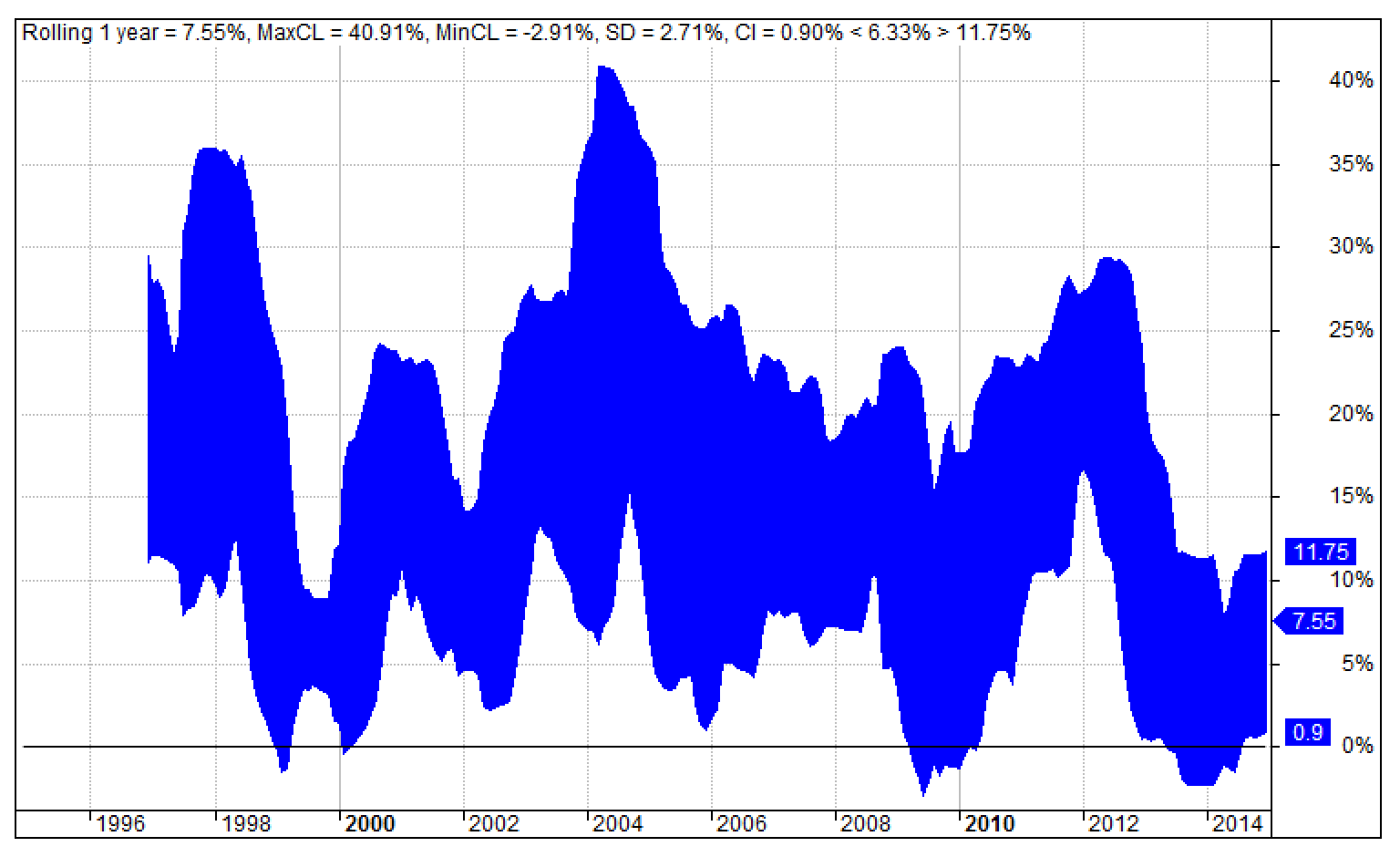
The below chart of the rolling 1-year return for the GTAA’s Top=3 scenario illustrates the application of the combined rolling 1-year-return requirement. The absolute return performance levels are the horizontal lines at 0% (solid black) and -5% (dotted red) with the metrics denoted by the two R1yWin values on the right side of the chart’s title section. Note the required win rates are not satisfied for this scenario.
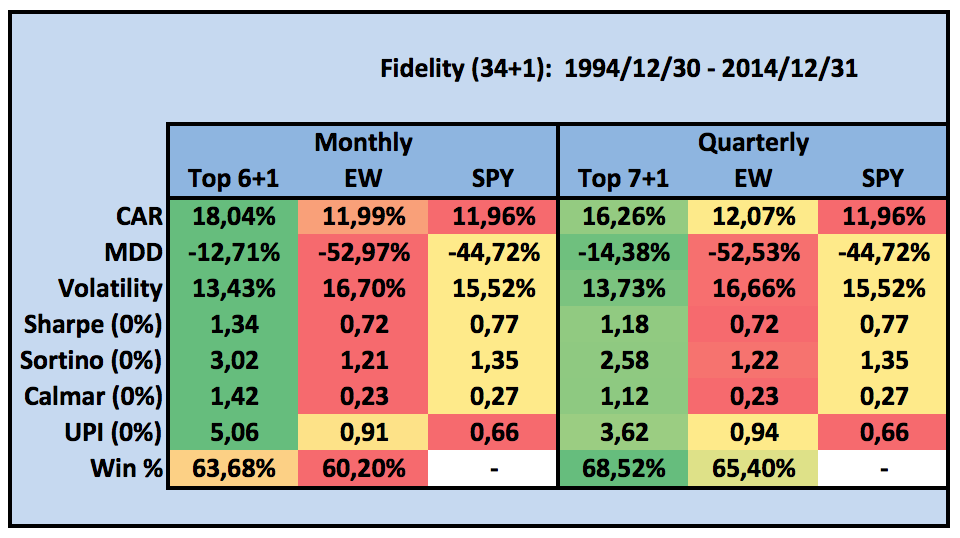


PAA performance

Contrary to the GTAA safe harbor capital assignment, which is dependent on the number of Top assets not above their long-term SMAs, instead PAA with its multi-market breadth driven c(r)ash protection routine allocates capital to the safe harbor asset based on market-breadth for the full universe, so independently from the Top size (see again the capital fraction table earlier in this post).

The following table shows the impact of protective momentum for PAA with the protection level set to low (pf=0, denoted PAA0) for the same model scenarios GTAA was backtested for above.


Note that PAA0’s Top=12 scenario at low protection level is equal to GTAA with Top=12, so the reported results are equal. As stated, for the Top=6, 4, 3 scenarios the difference lies in the safe harbor capital allocation. While GTAA only checks timing for its top assets, PAA0 does so for its full universe. Albeit for every top scenario PAA0 realizes lower return R than GTAA (each roughly 1% lower), PAA0 reduces volatility V and drawdown D considerably. This holds true for risk adjusted return too (see SR and MAR). However, despite the improved risk adjusted returns, for none of the scenarios with PAA at low protection absolute return performance is reached. The R1yWin rates falter just below the required 95% and 99% levels.

As the below table shows, when the protection level is increased to high (pf=2, denoted PAA2), PAA2 does attain absolute return performance for three of the four scenarios (Win rates noted bold): Top=12, 6, 3 with scenario Top=4 barely missing its mark.


Compared to PAA0 risk adjusted performance is improved with PAA2, but once again at the cost of return R (0.8%-1.6%). With regard to optimal risk adjusted performance the Top=6 scenario looks appealing considering it achieves the highest MAR and R1yWin>-5% (tie) and second best Sharpe and R1yWin>0% readings.


“Crisis alpha”

For the N12 universe at hand, with high protection enabled PAA invests on average over 50% in “cash” (see sub-pane of equity chart below). Although capital is well preserved with a short-term treasury asset like SHY, this also constitutes a drag on portfolio performance. However, swapping SHY for i.e. TLT introduces higher duration risk and goes along with more volatility and drawdown. Instead, the intermediate treasury fund IEF appears to be the trade-off as a replacement for cash. Still, the deployment of an alternating “safety asset” proved to be the best choice in risk adjusted terms. Thus PAA is less vulnerable to rate hikes, while at the same time the prospect to increase crisis alpha – higher risk adjusted performance during market crises - is not forfeited. With multiple safe harbors for sheltering on alert, capital is allocated to the treasury asset with the highest relative momentum score irrespective of the sign. For more on “crisis alpha” check Nathan Faber's winning NAAIM Wagner Award paper The Search for Crisis Alpha: Weathering the Storm Using Relative Momentum.


The above table shows the performance break down of PAA2 with Top=6 sorted on R1yWin(>0%). Regarding absolute return performance the SHY/IEF pair manages to combine the highest Win rates with near top R, second best SR plus MAR and third best V and D. Noteworthy is the impressive risk adjusted performance registered by both the single IEF and the single SHY scenarios too.

(*) For demonstration purposes three scenarios with TLT are listed too. Deployment of TLT as a storm shelter implies TLT features both in the “risk-on” universe as well as the “risk-off” universe. Notice the high drawdowns for each of these combinations along with elevated volatility levels, proving the point that TLT nor its combinations may regarded favorable for storm sheltering. Furthermore the return of IEF and its combinations is equally good or better along with lower volatility and left tail risk.


Comparison line up

To conclude this introduction of protective momentum first PAA2 with Top=6 is compared to three other strategies:
  • EW (1/N for N12 equities universe, monthly rebalancing),
  • SPY (buy and hold),
  • 60/40 (SPY/IEF, monthly rebalancing).
The PAA2 results are for the N12 universe with SHY/IEF to pick as “safety asset”. Next some detailed charts for the PAA2 scenario at hand are presented.


The chart depicts (in semi-log scale) the equity curves of the four strategies in “wet paint” fashion to emphasize depth and duration of drawdowns. For PAA2 the chart’s subpane shows the capital allocation for the safety asset: SHY or IEF. The table holds the performance metrics of the four charted strategies.

PAA2 paints a smooth curve with shallow and constrained drawdown periods. Actually, time spend in drawdown is only 48.70% with a longest drawdown period of 19 months against SPY’s 68.52% and 74 months. Return is higher not only in risk adjusted terms, but also in absolute terms thanks to low volatility and drawdown readings. This demonstrates the key benefit of protective momentum: the low-risk profile keeps drawdowns in check during times of market turmoil.

Over recent years the performance of PAA2 lags the 60/40 benchmark as well as SPY. The lower return reflects the “insurance premium” due for PAA2’s market-breadth capital protection which typically leads to outperformance during bear markets and underperformance in prolonged bull.


Performance charts

To conclude this introduction of PAA some detailed charts offer more perspective into PAA2’s performance with Top=6 selection.

Annual returns:


Profit contribution:


Capital allocation:


Drawdown:


Monthly return distribution:


Rolling 1-year-returns:


Rolling 1-year-return confidence channel:


“Real time” strategy signals

Google Sheets allows for monitoring the chosen PAA strategy after the close of the month. The Gsheet shows the one year history of the Top=6 selection, the number of assets with positive momentum, the bond fraction and the rolling 1-year performance. Below the historical table, the current selection is presented with their respective position sizes: see the two rows above the yellow warning box. The Gsheet is accessible through this blog's Strategy Signals section.

Gsheet with PAA2 signals for April after the close of March, 2016.

Point to note: only with a BF < 100% capital is allocated to the top selection, hence the positions sizes for the April 2016 Top=6 selection are 0.00%. All capital goes to the best safety asset: IEF.


Final remarks

As stated in our paper, we consider the multi-market breadth approach for determining the safety asset’s capital fraction as the main innovation of Protective Asset Allocation. The routine as such may be regarded as a safety module which can be applied easily to general momentum models with volatility and/or correlation effects, like Keller’s EAA (see paper and primer).

Disclosure: long IEF.

The full AmiBroker code for PAA is available upon request. Interested parties are encouraged to support this blog with a donation.


Deciphering Correlation Hedged Momentum

$
0
0
In a new SeekingAlpha contribution we combine PAA’s protective multi-market breadth approach with a generalized momentum metric based on correlation hedged returns. The resulting model is called Generalized Protective Momentum (GPM). In this blogpost the correlation hedge is deciphered.


The correlation hedge is a simplified version of Keller and Butler’s EAA-formula (see paper or primer). For GPM we only use return and correlation information as momentum metric. We do so with two variations:
  • GPMxM: the correlation multiplied return metric ri * ( 1 – ci )
  • GPMxF: the correlation fractioned return metric ri / ( 1 + ci )
where x is the degree of crash protection, ri is the average return of asset i over 1, 3, 6 and 12 months, and ci the 12-month correlation of asset i with the equal weighted “risky” investment universe. The correlation multiplier ( 1 – ci ) is based on the EAA-model, the correlation fraction 1 / ( 1 + ci ) was recently suggested by Wouter Keller. For the mechanics of the crash protection algorithm, see the PAA-post.

In the graph below, the two correlation hedge variations are painted.


Notice how ri is downplayed by the multiplier variation ( 1 – ci ) (blue curve) for assets with positive correlations more and more (the hedge multiplier approaches 0 when ci approaches 1), while ri is amplified in a near linear fashion for assets with negative correlations (the hedge multiplier increases to a maximum value of 2 when ci approaches -1).

For the fraction variation 1 / ( 1 + ci ) (red curve) the hedge effect is inverted: for assets with positive correlations ri is downplayed by half (the maximum hedge fraction is 2 when ci approaches 1), while ri is increasingly amplified for assets with negative correlations (the hedge fraction approaches 0 when ci approaches -1).

We will illustrate the two hedge variations for the “risky” N12 globally diversified universe as demonstrated in our PAA-paper (SPY, QQQ, IWM, EEM, VGK, EWJ, IYR, GSG, GLD, TLT, HYG and LQD). As safety asset we deploy the best out of two treasury ETFs: SHY and IEF, using the same correlation hedged momentum measure for selection. Each month 3 out of 12 assets with the highest correlation hedged return readings are eligible for capital allocation next to the safety asset's allocation. The backtests cover the 45+ year period December 1970 until May 2016.

Contrary to our SA-contribution where high protection is applied, we will now backtest GPM with low protection. Quick re-cap: with low protection (so x = pf = 0, see PAA-post) for each “risky” asset with non-positive momentum a capital fraction of 1/N is allocated to the safety asset. With low protection GPM leaves more room to the “risky” assets for harvesting risk premia. This also allows for a good look at the absolute and relative changes in average capital allocation for the risky assets.

The table below holds some key performance indicators for three variations of GPM:
  • GPM0R: unhedged “raw” 1/3/6/12m return and low protection (green)
  • GPM0M: correlation multiplied return and low protection (blue)
  • GPM0F: correlation fractioned return and low protection (red)

NB! All results in this post are derived from synthetic monthly total return data constructed by us based on indices net of costs. Furthermore trading costs, slippage and taxes are disregarded. Results are therefore purely hypothetical.

None of the low protection scenarios of GPM meet our positive performance requirements: rolling 1-year return win rates of above 95% and 99%, but the mark is barely missed (with medium or high protection enabled GPM does satisfy the requirements for both correlation hedge variations. See our SA-contribution). Regarding risk-adjusted performance, both hedged correlation variations beat GPM’s unhedged “raw” return baseline scenario, see for example the lower drawdown (D), the higher Sharpe (SR) and MAR ratios.

The table below shows the effect of the correlation hedge on the average capital allocation for both the hedge multiplier and the hedge fraction compared to the unhedged “raw” averaged return version of GMP, all with the PAA-like capital protection set to “low” (0). The capital allocations for the safety assets SHY and IEF are excluded from the table.


Notice that for ri * ( 1 – ci ) compared to ri emphasize is added to EWJ, GSG, GLD, TLT, HYG and LQD, while SPY, QQQ, IWM, EEM, VGK and IYR are de-emphasized.

Compared to ri, for ri / ( 1 + ci ) the capital allocations for SPY, QQQ, IWM, EEM and VGK are downplayed again, but less strongly than with ri * ( 1 – ci ), EWJ and IYR both get about the same allocations, while GSG, GLD, TLT, HYG and LQD are again emphasized, but to a lesser extent.

The table below holds the relative changes in average capital allocations for each asset compared to the ones for ri.


Especially the change for SPY stands out: compared to the unhedged ri baseline the correlation hedged multiplier ri * ( 1 – ci ) causes a reduction in capital allocation of 85% (5.5% to 0.8%) On the opposite end of the spectrum LQD is to be found with an amplification from 2.5% to 7.2%, a gain of nearly 290%, followed by TLT and HYG with a gain of 255% and 229% respectively.

The impact on average capital allocation demonstrates the provident characteristic of the hedge multiplier ( 1 – ci ) through the strong emphasis foremost on bonds and secondly on “physical” assets to the detriment of stocks. The hedge fraction 1 / ( 1 + ci ) shows a similar, but less distinct effect, leaving more room for stocks to prospect risk premia.

The effect of the correlation hedge is noticeable on the following two screenshots of monthly rankings for a 3 out of 12 asset selection. Based on “raw” return ri, the top three assets are: IYR, QQQ, EWJ. However, due to the correlation multiplied hedge ri * ( 1 – ci ) the generalized momentum top three becomes: EWJ (3), GLD (7), VGK (5). Because of its negative correlation reading, GLD climbs from 7th to 2nd place. The opposite happens for IYR: as a result of its high correlation IYR drops from 1st to 4th place, out of reach for capital allocation. This occurs also for QQQ, which drops from 2nd to 6th place.


The second screenshot shows the monthly rankings for the correlation fractioned hedge ri / ( 1 + ci ). Due to the strong amplication of its negative correlation reading, GLD (7) even climbs to 1st place, followed by IYR (1) and EWJ (3, so unchanged). High/positive correlations are downplayed too, but to a lesser extrent. IYR declines from 1st to 2nd place, still eligible for capital allocation. QQQ drops from 2nd to 5ft place and gets no capital allocated.


The observed characteristics of the two hedge approaches present themselves in the following cumulative profit contribution table too.


The difference in hedge effect are most clear when we review the relative changes in cumulative profit contributions as shown in the table below.


For the hedge multiplier ( 1 – ci ), EEM (18%), IWM (32%) and SPY (35%) form the lower-end extremes, while LQD (439%) and GSG (527%) are the higher-end extremes.

The impact of the hedge is controlled by the (non-stationary) correlations of the respective “risky” assets. To illustrate the differences in correlations and their non-stationary nature, the following chart has in the upper price pane the equity curve of the monthly rebalanced risky N12 equal weighted (1/N per asset) portfolio (black) as well as the equity curves of three buy-and-hold investments: for SPY (blue), TLT (green) and GLD (orange “gold”) respectively. In the three subpanes the 12-month correlation coverage is plotted for the equal weighted N12 with SPY, TLT and GLD respectively.


The chart above shows that an asset like SPY, which on average reflects a high correlation with the N12 risky universe (see the correlation graph in blue), generally will be substantially downplayed through the correlation hedge term. Hence SPY has a slim chance on selection for capital allocation. On the other hand, assets like TLT and GLD benefit especially during the periods when their correlations are negative, resulting in a hedge induced boost of their momentum rankings and thereby fatter chances on capital allocations.

To wrap-up: Highly correlated assets are downplayed most pronounced by the correlation multiplier hedge ( 1 – ci ) and to a lesser extent by the correlation fraction hedge 1 / ( 1 + ci ). For low correlated assets the effect is inverted. Both correlation hedges have about the same impact for assets with correlations in the -0.25 until +0.25 range. Joining the generalized momentum measure based on correlations and returns together with our multi-market breadth crash protection algorithm, leads to conservative capital allocations resulting in higher risk-adjusted performance.

Special thanks to Wouter Keller for his support and contributions to this post.

The monthly asset selections for GPM's correlation multiplied momentum approach ri * ( 1 - ci ) with high protection are available on the Strategy Signals page.

Disclosure: long GLD, IYR, IEF.

The full AmiBroker code for GPM is available upon request. Interested parties are encouraged to support this blog with a donation.


Summer reading

AllocateSmartly

$
0
0

Launched only recently, AllocateSmartly.com tracks the industry’s best tactical asset allocation strategies with thorough, up-to-date backtests. As of writing 16 (sub) strategies are tracked and benchmarked on near real-time basis. All of the tracked strategies are both quantitative and systematic, meaning well-defined mathematical rules govern exactly when and what to trade. Among the featured strategies are GEM, GTAA, EAA and PAA. Take the platform for a test drive with a free limited membership or sign up for full membership to access all the neat features.


Disclaimer: no affiliation.

Prospecting Dual Momentum With GEM

$
0
0
  • Gary Antonacci popularized dual momentum with an effective and simple approach for dynamic asset allocation: Global Equities Momentum (GEM).
  • Using simulated ETF data series, GEM’s performance over past market conditions can be approximated.
  • For longer investment horizons GEM’s implementation with ETFs obtained positive returns with high consistency.
After winning first place in 2012 in the NAAIM Wagner competition, Gary Antonacci popularized his momentum investing approach in the award winning book “Dual Momentum Investing”.


In his book Antonacci makes a strong case for combining relative strength price momentum with trend following absolute momentum. The first 90 pages are a comprehensive overview, introducing the “premier market anomaly”,  describing the history of momentum research and its early practitioners, behavioristics and lots of other interesting themes. Frankly, these pages alone make the book a must read, not least due to the conversational, at times even playful tone of Antonacci’s light pen.

At the center of the book lies the chapter covering Global Equities Momentum (GEM), where Antonacci explains the mechanics of the dual momentum approach for dynamic asset allocation. GEM is quite brilliant in its simplicity: a 12-month lookback for both absolute and relative momentum combined with just three asset classes, are all of GEM’s components.

Both in his book and on his website, Antonacci presents the Global Equities Momentum (GEM) approach with non-tradable total return index data. Going back as far as the seventies has the benefit of incorporating a rising yields decade too. Therefore, to get insight into GEM’s long-term performance with today’s ETFs, index based simulated total return proxies are required. By applying GEM’s dynamic asset allocation to such simulated ETFs, the practitioner may get a good impression (nothing more) of GEM’s “real” performance during past market conditions. Before doing so, first GEM’s performance with index data will be replicated to validate the accuracy of the presentation in this contribution.

Noteworthy, the rules often shared for GEM, derived from the flow chart on page 101, are not the official GEM rules. Actually the flow chart along with the corresponding instructions on page 112 is only a simplified way to determine GEM’s allocations for those using a website like PerfCharts to get their signals. However, when doing calculations with a charting program like AmiBroker, the instructions on page 98 are to be adhered instead.

In contrast to common practice, GEM’s official rules administer absolute momentum before the application of relative strength momentum. According to recently confirmed academic research the U.S. stock market tends to lead the rest of the world especially during recessions, hence the trend of stocks is determined first using just the S&P 500 index. Only when an uptrend in the S&P 500 is identified by comparing its 12-month total return against that of the 3-month U.S. T-Bill, relative strength momentum is applied to select the best performing stock index for allocation: the S&P 500 index or the All Countries World Index ex U.S. Otherwise the U.S. Aggregate Bond index is selected for capital preservation. For more about GEM’s mechanics and the strong case Antonacci builds for dual momentum investing see his highly recommended book and the FAQ on his website.

In the following chart both the official version (INDEX98 in black) and the simplified version (INDEX101 in gray) are painted along with GEM’s three index components. The upper subpane shows the monthly allocations according to GEM’s official rules. The lower subpane has the allocations following the simplified logic.

NB! Results are derived from non-tradable monthly total return indexes and are therefore purely hypothetical.

Close inspection of the two allocation panes reveals how the official set of rules has GEM switching to bonds earlier than the simplified approach, but comes along with slightly more whipsaw too. The earlier switch to risk-off results in higher absolute return as well as better risk-adjusted performance as shown in the statistics table. For the remainder of this contribution the official GEM logic is observed.

Validating the monthly selections against GEM’s published allocations gives a match for all but 3 out of 540 months (1971-2015). The 3 observed differences are due to the application of the 30-day T-Bill total return series instead of the 3-month T-Bill.

Now let’s apply GEM to the markets with today’s ETFs: IVV, BND and VEU (per Antonacci’s FAQ). For the following simulation the data histories are back extended with the underlying total return index and corrected for the observed tracking error between the ETF and the underlying total return index.

The next chart shows the simulated ETF performance for GEM (black) with BIL as risk free proxy against the index performance (dashed) and the 3 ETFs eligible for allocation. Again, the subpane has the monthly allocations confirming the low turnover of the approach, while also showing the inevitable periods with some whipsaw.

NB! Results are derived from simulated monthly total return data based on indices corrected for tracking errors. Furthermore trading costs, slippage and taxes are disregarded. Results are therefore purely hypothetical.

As the charts shows, the ETF implementation tracks a near perfect footprint. Remarkably, the risk-adjusted performance of the ETF implementation even exceeds that of the original index version as shown in the statistics table. Notable is the 3-year positive win rate of more than 99%.

Due to GEM’s drawdown profile as charted below for the ETF implementation, the investor needs to have a longer investment horizon for being able recover. Point to note: for a lot of sensible investors a drawdown close to 20% is a deal breaker because a netted 25% recovery is required only to get back to break-even again. However, in the longer run GEM proves to be quite resilient as the chart ahead will show.


For the long term investor GEM’s tendency to recover is shown on the following chart The chart depicts the rolling 3-year return for GEM (red) and SPY (blue). In contrast to SPY’s prolonged sub-zero periods, notice GEM hardly ever dips down the 0% water mark. This is indicative for GEM’s high consistency in registering positive returns on investment for nearly all 3-year periods during 1974-2015.


The dual momentum approach identifies the overall market direction – are stocks globally expected to go up or down? – by putting U.S. stocks to the absolute momentum test. To pass the absolute momentum threshold U.S. stocks, in the ETF approach represented by IVV, need to outperform an (assumed) risk free investment like in 30-day or 3-month U.S. T-Bills. The following chart compares GEM’s application with 4 different absolute momentum proxies: BIL (blue), SHV (magenta), SHY (green) and a 0% cash holding (red). The original (non-tradable) index performance is again added for reference (dashed black). For “live” application BIL or SHV appear to be the best choices, confirming Antonacci’s FAQ.

NB! Results are derived from simulated monthly total return data based on indices corrected for tracking errors. Furthermore trading costs, slippage and taxes are disregarded. Results are therefore purely hypothetical.


Strategy signals

The monthly asset selection for GEM is available on the Strategy Signals page.


Endnotes
  • Different from the book, the statistics tables show CAGR readings and conservatively CAGR-based Sharpe ratios.
  • The author has no affiliation with Gary Antonacci nor AmiBroker and receives no compensation from anyone of them.
  • This contribution is simultaneously published on SeekingAlpha.

Disclosure: The author has no positions in any stocks mentioned, but may initiate a long position in IVV, VEU, BND over the next 72 hours.

The full AmiBroker code for GEM is available upon request. Interested parties are encouraged to support this blog with a donation.


Flexing VBA For Quants (And Everyone Else)

$
0
0
Would it not be great to have the models for Protective Asset Allocation (PAA) and Global Protective Momentum (GPM) in Excel, so you can run your own backtests without AmiBroker? And not being limited to a pre-defined universe? Actually, now you can.


Based on a foundation by InvestExel, Denis Bergemann from Germany collaborated with me in developing an Excel spreadsheet that allows you to select your preferred risk-on and risk-off assets, set backtest parameters to your liking and review results by their statistics as well as in graphical format.


The work flow goes like this:
  • Run the backtest after Yahoo has published the closing data for the month
  • Enter the risk-on and risk-off assets in the two dedicated columns of the sheet
  • Set start and end dates
    (NB! Observe a 1-year initialization period for the ETF with the shortest history)
  • Keep frequency at m (=monthly quotes)
  • Adjust protection level* (default = 2: high protection)
  • Select number of top assets
  • Click the button [Download Data] and wait until downloading has finished
  • Finally click the button [Calculate Systems] and wait for the VBA magic to finalize.
The VBA-code embedded in the Excel sheet takes care of downloading the data as well as all the necessary calculations and permutations.


The sheet allows for adjusting the protection level or the top selection without a new download, but changing the backtest range or altering the asset lists requires to start with a fresh data download.

Please note the number of risk-on or risk-off assets is not restricted to 12 and 2, just select the ETFs and/or mutual funds you prefer.

The sheet also shows the allocation percentages for the upcoming month after Yahoo has published the monthly closing data, usually available a couple of hours after the NYSE market session has ended on the last trading day of the month.


End notes
  • The sheet only works with Windows.
  • The protection level is simplified to ( p * ∑ [ri <= 0] ) / N, so p = 0 turns the protection logic off. With p = 2, the protection level equals high protection as used in the presentation of PAA and GPM.

The Excel sheet for PAA / GPM is available upon request. Interested parties are encouraged to support this blog with a donation.


Ho, Ho, Ho: Excel VBA For Global Equities Momentum

$
0
0
Just in time for Santa! Based again on a foundation by InvestExcel, Denis Bergemann collaborated with me on another Excel VBA project covering Gary Antonacci's popular Global Equities Momentum (GEM).


The VBA driven Excel spreadsheet follows the official rules for GEM (see here) and allows you to select your preferred US and International stocks fund. This applies also for the out-of-market bond fund and for the proxy fund for observing the risk free rate. The lookback parameter for both relative and absolute momentum is user adjustable. Results are presented in tabular and graphical format.


The work flow is pretty much identical to the one for the PAA / GPM VBA (see here):
  • Currently, the sheet only works with Excel for Windows
  • Run the backtest after Yahoo Finance has published the closing data for the month
  • Enter the three required stock funds in the dedicated column of the sheet
  • Repeat for the out-of-market bond fund and the proxy fund resembling the risk-free rate
  • Set start and end dates
    (NB! Observe an initialization period for the fund with the shortest history equal to the chosen lookback range)
  • Click the button [Download Data] and wait until downloading has finished (graphs and tables will disappear)
  • Finally click the button [Allocation] and wait for the VBA to crunch the numbers (graphs and tables are reprocessed).
The VBA-code embedded in the Excel sheet takes care of downloading the data as well as all the necessary calculations and permutations.


Please observe the required number of five assets (no more, no less!) as indicated in the spreadsheet.

Running the spreadsheet at the end of the month, after Yahoo Finance has published the closing data for the month, will give the allocation for the upcoming month. End of month data is usually available a couple of hours after the NYSE market session has ended on the last trading day of the month. Since GEM deploys an all-in approach, the allocation percentage is 100% of dedicated capital.

Merry Xmas!

The Excel sheet for GEM is available upon request. Interested parties are encouraged to support this blog with a donation.


Index Mapping For ETF Proxies

$
0
0
In order to present results as realistic as possible in our PAA-paper, we constructed long-term end-of-month data series for popular ETF proxies, like SPY, GLD and TLT (see paper appendix on SSRN). All data series start December 1969. For the pre-inception history, the proxies are derived from suitable indices. As part of a complete revision of the long-term data set, we recently improved the construction of the data series by mapping the underlying index through a linear formula to arrive at the best fit over the life span of the ETF to be replicated. The construction process is demonstrated below for EFA. The link to an example spreadsheet with all the necessary calculations is published at the end of this post.


EFA seeks to track the investment results of the MSCI EAFE index which is composed of large- and mid-capitalization developed market equities, excluding the U.S. and Canada. The index data is available as free download from the MSCI website. Comparing EFA’s historical data record against the various index levels supported by MSCI like Price, Gross, Net, reveals the MSCI EAFE Net index as underlying index. Historical dividend adjusted data for EFA itself is offered by Yahoo Finance, also for free. For constructing a long-term EFA proxy the data from both sources is required.

With the data readily available in Excel, the next step is to derive the data for the ETF-proxy from the underlying index for the In-Sample (IS) period. The goal is to map the underlying to arrive at the best fit over the life span (=IS) of the ETF through a linear formula: r+ = b * r + a, where “r” is the return of the index and “r+” is the return for the proxy. The values for the coefficients “a” and “b” are determined through Excel’s Solver add-in by minimizing the unexplained sum of squared deviations for the return series of EFA and the ETF-proxy.


After Solver finishes the calculation cycles, the found coefficients result in high R-Squared and correlation readings.


Visual inspection of the resulting curves shows a high degree of fit with minimal distortions.


The found mapping formula can be checked by plotting the return series of MSCI EAFE and EFA as scatter graph with the linear regression line overlaid. The coefficients of the regression line match with the ones derived by Solver. Hence the scatter graph approach offers a handy shortcut, making the Solver approach essentially superfluous.


Furthermore the results may be double-checked by a regression analysis through Excel’s Analysis Toolpak add-in. The low Significance F reading (below 0.05) shows the found coefficients are reliable (statistically significant).


Having found statistically significant coefficients for the IS period (2001-2015), EFA's history can now be extended for the Out-of-Sample period, back to the inception date of the MSCI EAFE index: December 1969. The final result is a proxy for EFA covering 1969 - 2015: "EFA+"


After following the same workflow for other ETF’s, the final result is a collection of data series in Excel like the below sample (DummyData.xlsx):


To export the data from Excel and save each ETF-proxy in its separate csv-file, the following R-code* comes in handy. The code adds a $-prefix to each ETF’s name for distinction.
*The drawback of the xlsx library is its dependency on an older java version. Suggestions for a solution using another R-package are welcome in the comment section.

The output of the R-code is a collection of csv-files with dates and closes, ready for import in your charting program.


Sources of interest:
-Yahoo Finance
-MSCI
-NAREIT
-Fama/French
-Deutsche Bank IQ
-Quandl
-Morningstar
-Barchart
-Norgate Data
-Mike Middleton

The example spreadsheet along with the R-code and the DummyData.xlsx files are available on the Google Drive folder connected to this post.

Yahoo Finance API Ceased Working

$
0
0
Unfortunately this week the Yahoo Finance team changed the functionality of their financial data service. Apart from modifying the construction of the download link, the order and contents of the supported data fields have been altered too. As of writing support of total return data has been suspended.


Regretfully, as a result both the Excel VBA spreadsheets and the Google Sheets on the Strategy Signals page have stopped functioning. Until further notice I have no other choice but to discontinue these services from the blog.

Thank you for your understanding and please share your thoughts in the comment section below on fixes or alternative download sources.

For more information see the Yahoo Help Community.

Strategy Signals Powered By Quandl

$
0
0
Just in time for EOM May the Strategy Signals page is functional again. Like before, signals are based on dividend adjusted historical data, now obtained from Quandl's premium QuoteMedia EOD service ($$$). Current month's data is grabbed "real time" from Google Finance. The signals are  yet to be considered "experimental" in order to review data quality and table performance.

Viewing all 70 articles
Browse latest View live


<script src="https://jsc.adskeeper.com/r/s/rssing.com.1596347.js" async> </script>